Building a Sonic Identity in a Digital Landscape
Role: Founder & Creative Strategist | Disciplines: Brand Strategy, Content Strategy, Art Direction, Photography, Copywriting, Social Media Marketing
The digital music media space is saturated with news aggregates and algorithm-chasing listicles. My friends and I wanted to develop a publication that felt authentic, visual, and artist-forward—a destination for discovery, not just consumption. The challenge was to create a music publication from the ground up that could cut through the noise, build a loyal community, and establish a distinct, respected voice- all without a budget.
The Strategy
Grassroots Community Building: Partnering with local artists to grow from the ground up.
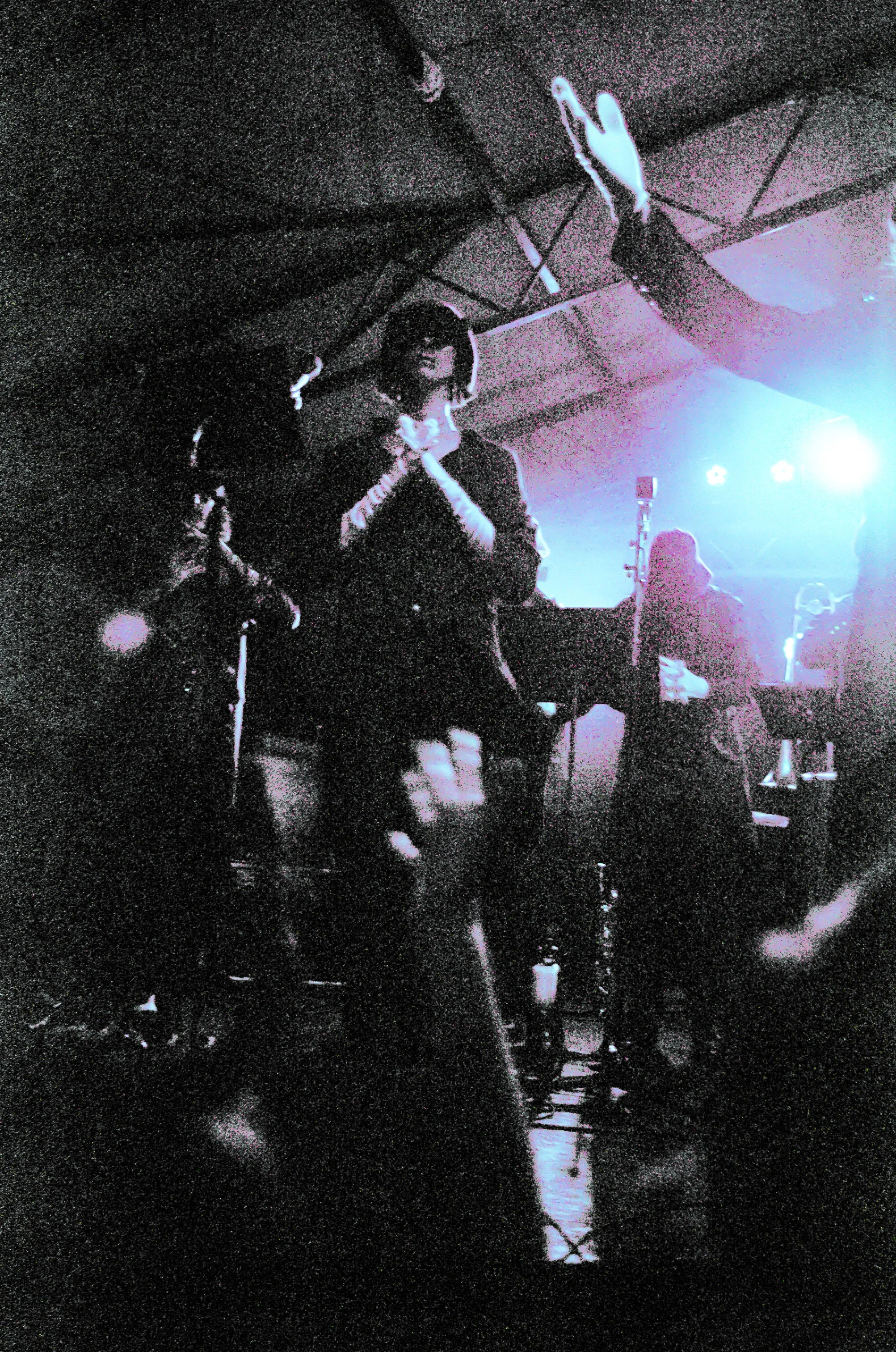
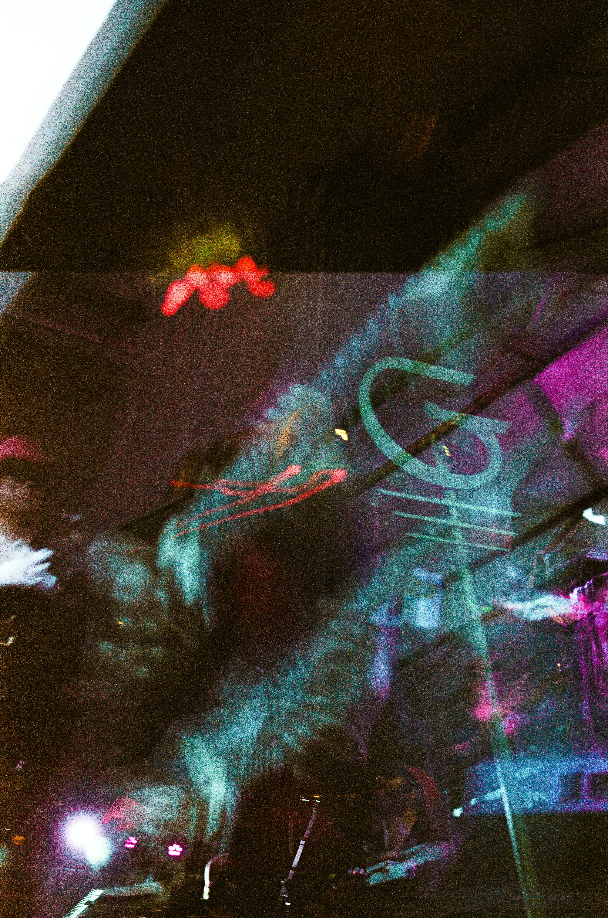
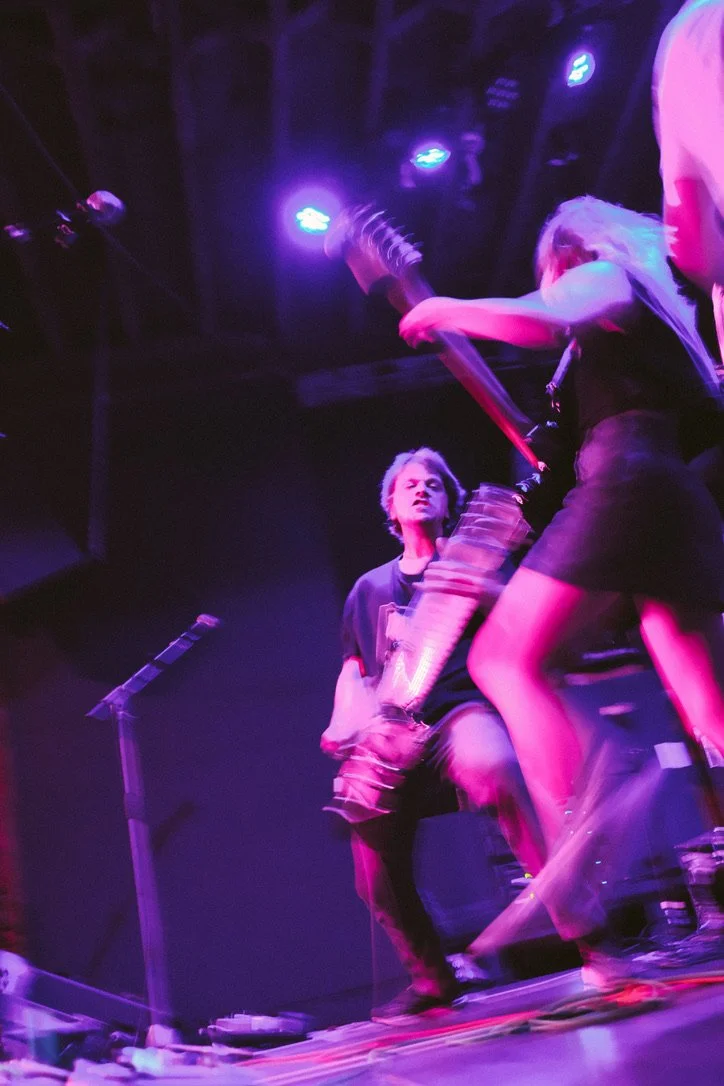
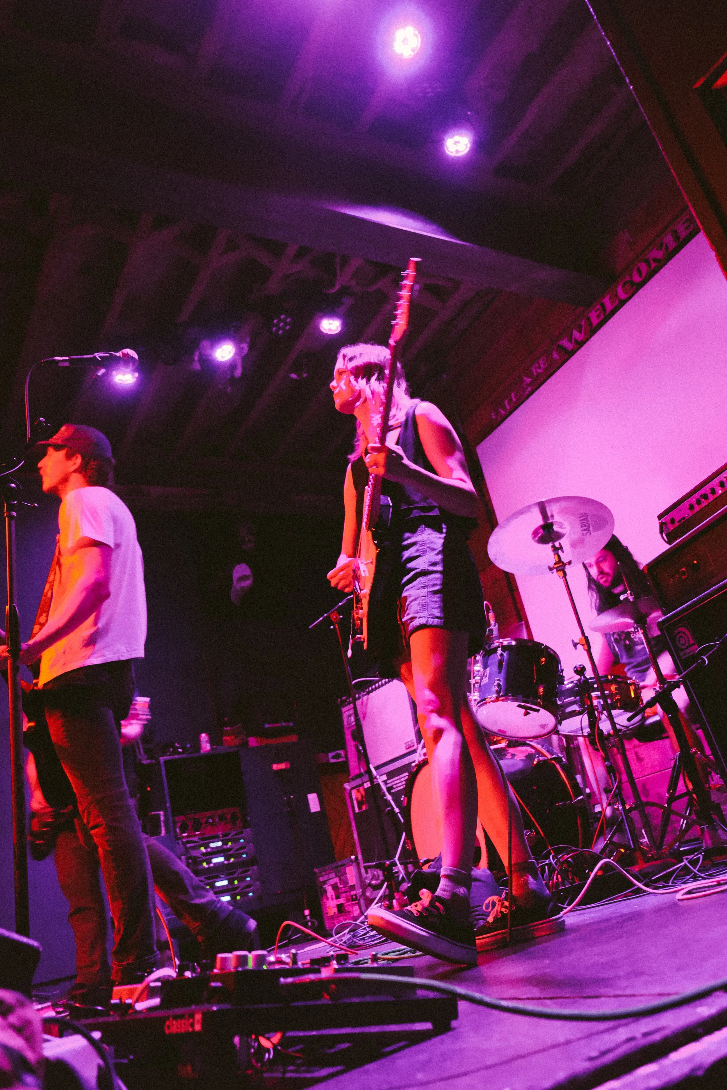
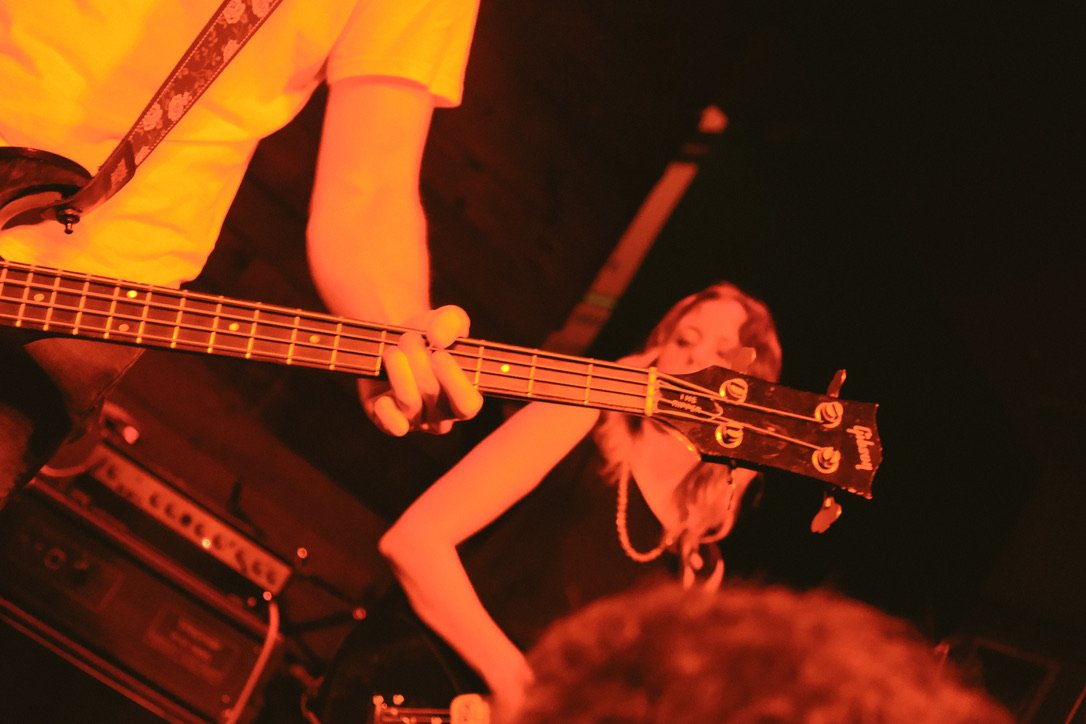
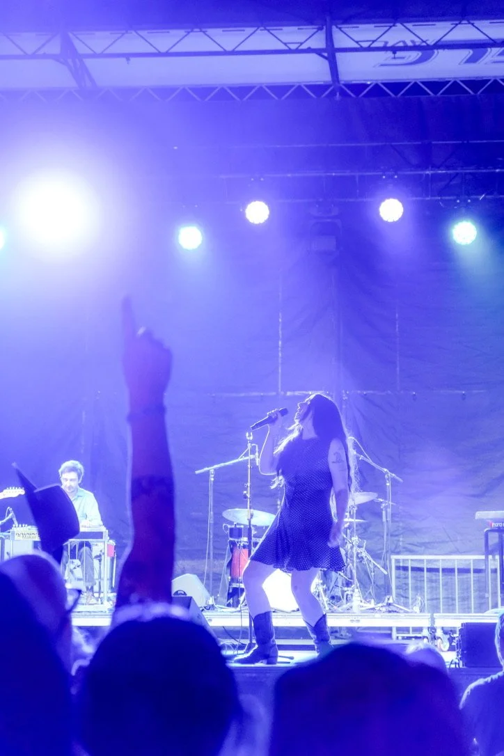
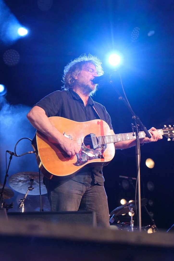
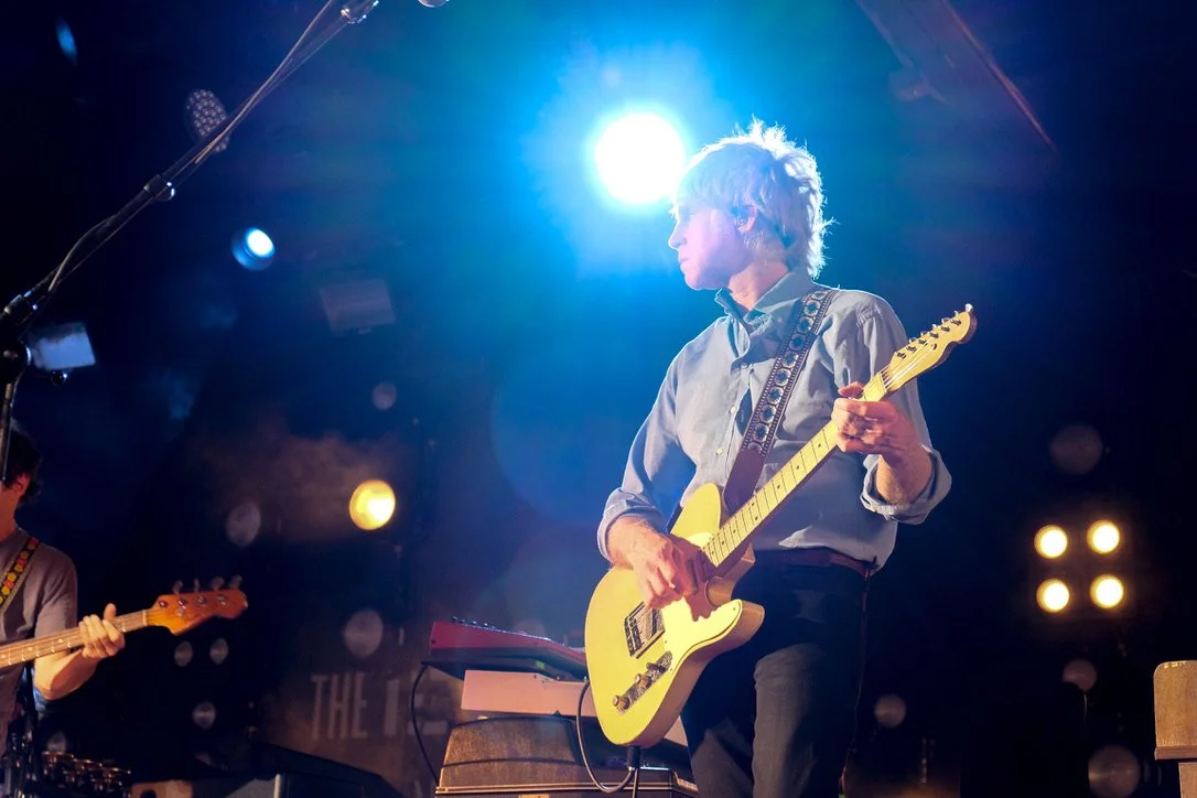
Visual Sonic Identity: Using concert photography as the primary visual language.
Artist-Centric Storytelling: Prioritizing long-form interviews.
Community as a Channel: Designing a social media presence that fosters conversation.


Leveraging Collaborative Content
& Artist Advocacy
The social strategy extended beyond our own posts to create a powerful ecosystem of shared content.
Providing Value to Extend Reach:
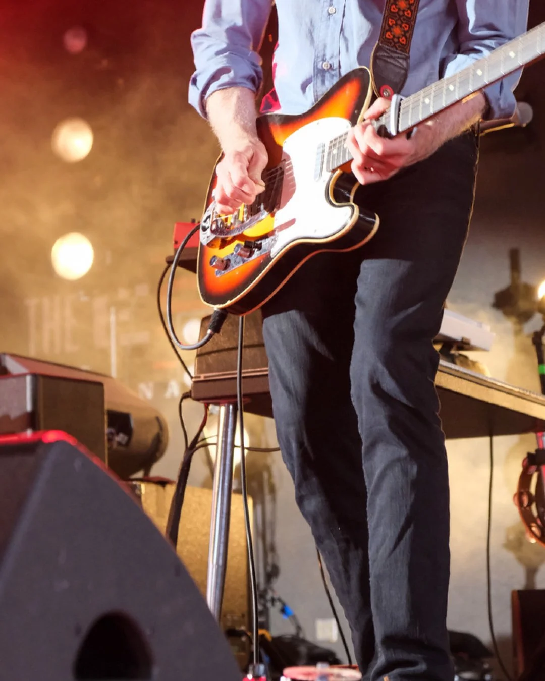
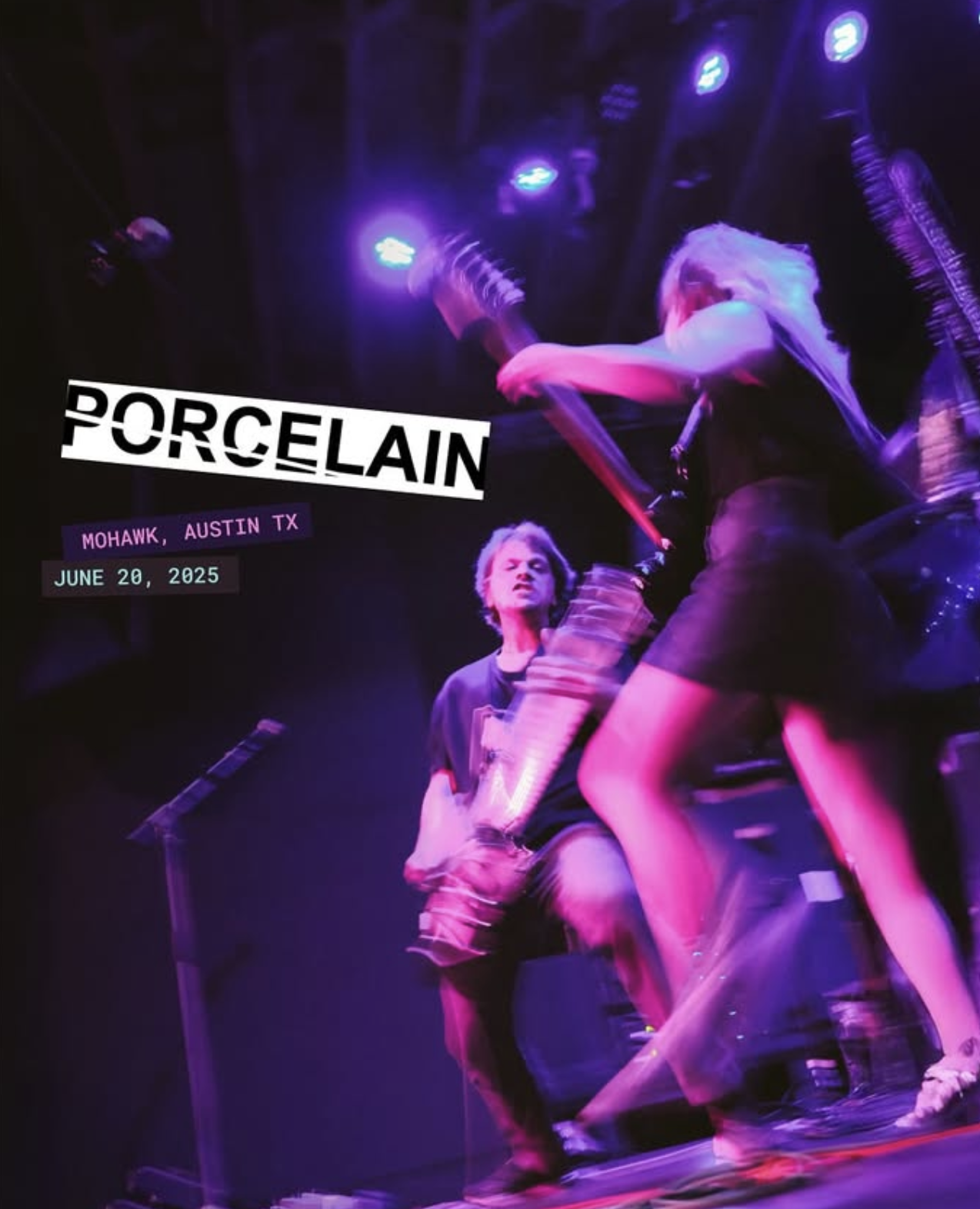
After every shoot, I provided artists with a "social media pack" of 3-5 edited photos, explicitly encouraging them to post the images on their own profiles. This solved a real problem for them (the need for high-quality visual content) and positioned Disko as a supportive partner, not just a media outlet.
The only requirement was that they tag our publication's handle in the photo and caption. This simple act introduced our brand directly to their follower base in a context of endorsement and authenticity—a far more powerful signal than paid advertising.
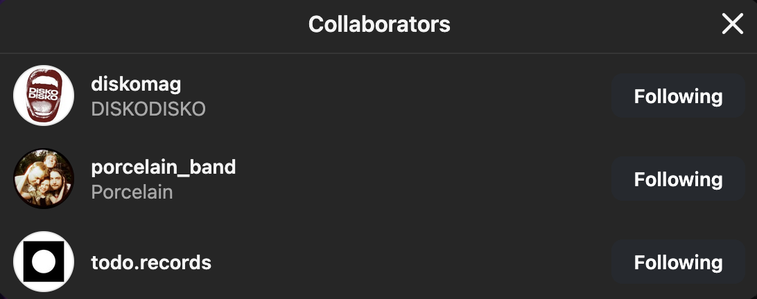
Amplifying with Collaborative Features:
For bigger features, we leveraged platform-specific tools like Instagram's Collaborative Posts. This allowed the artist and Disko to share the same post to both of our feeds, combining our audiences in a single, powerful piece of social proof that drove engagement and follower growth from a highly relevant demographic.
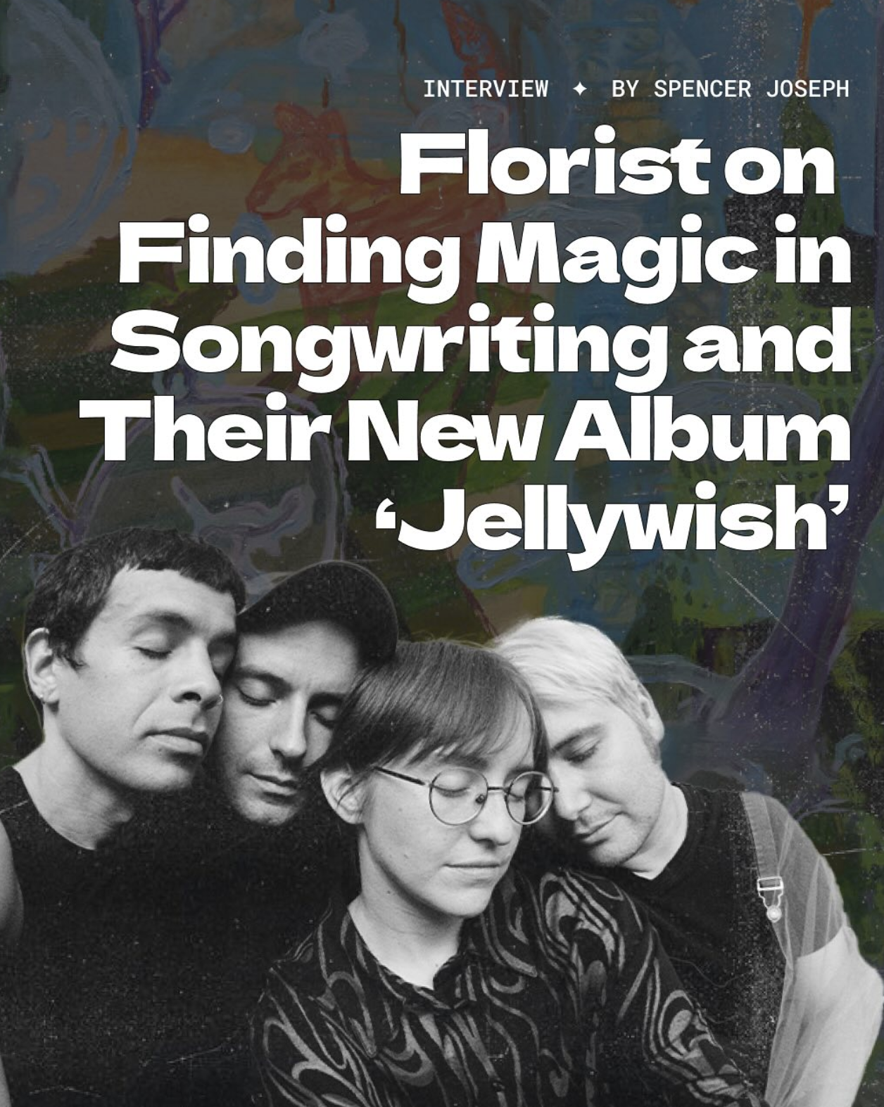
The Interview Engine:
Every artist interview was strategically crafted to be a shareable asset. We asked questions that went deeper than a typical promo, prompting artists to reflect on their local scene influences, creative challenges, and personal stories. This made the content genuinely engaging for their fans and incentivized the artist to share it across their channels, introducing our publication to their established followings.
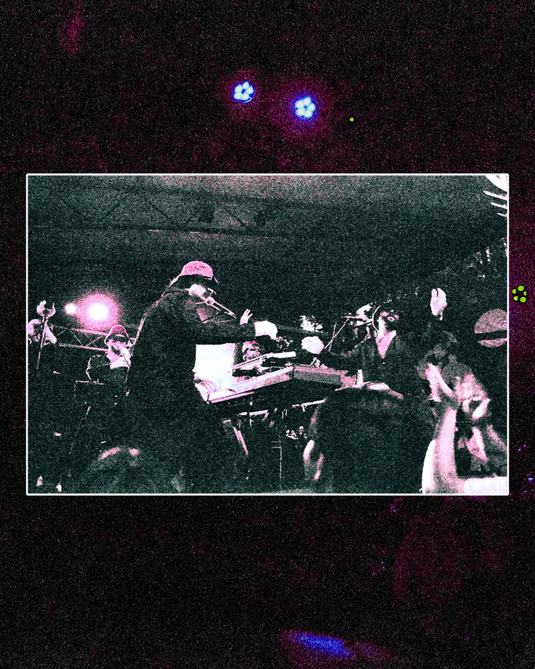
Brand & Visual Identity: Designing a Zine-Like Digital Experience
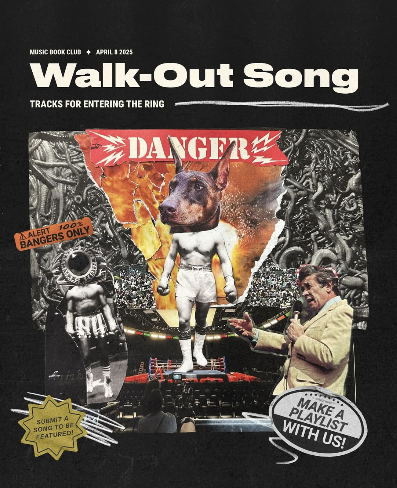
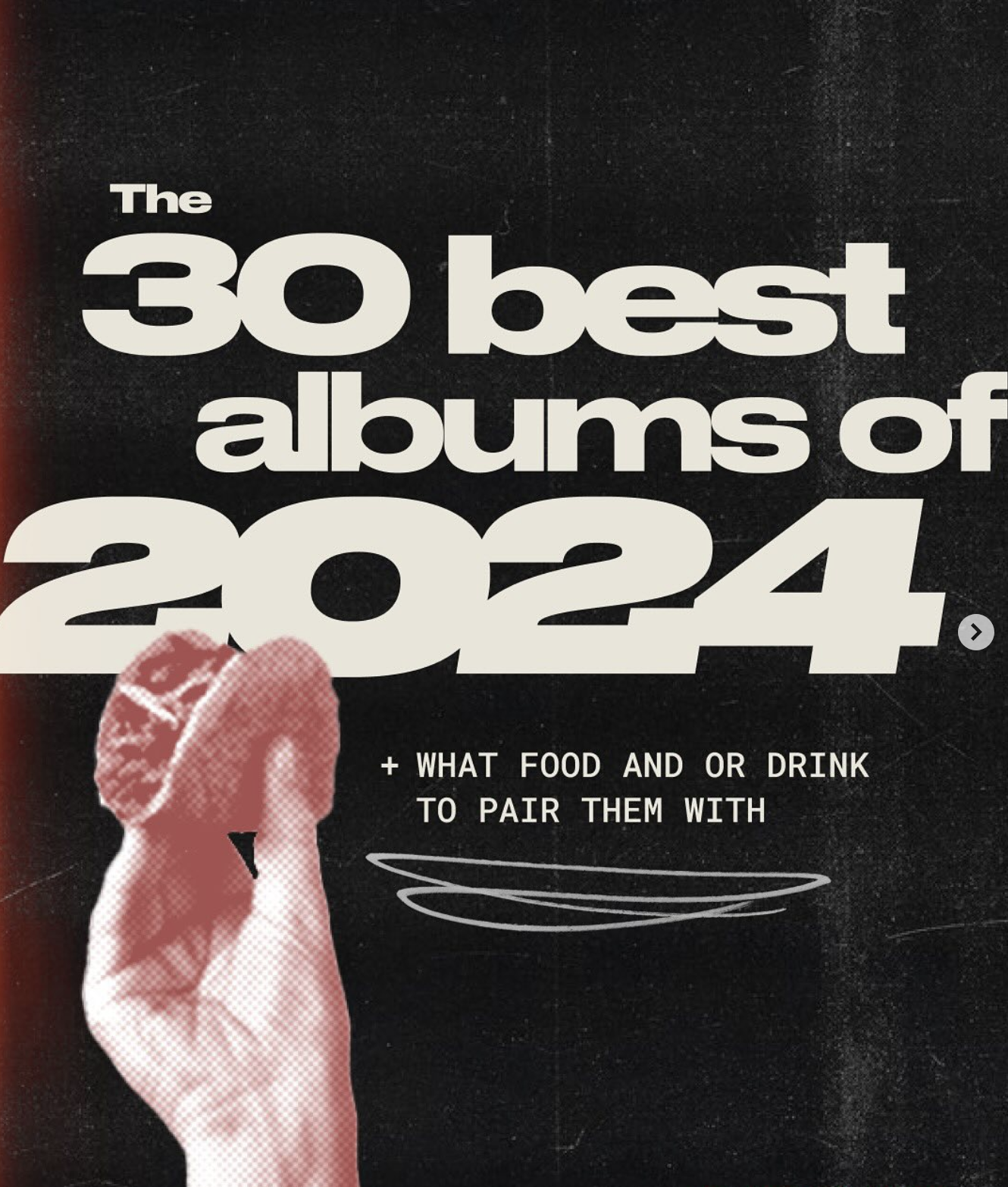
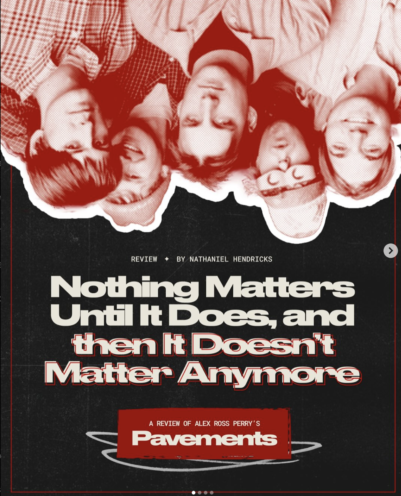
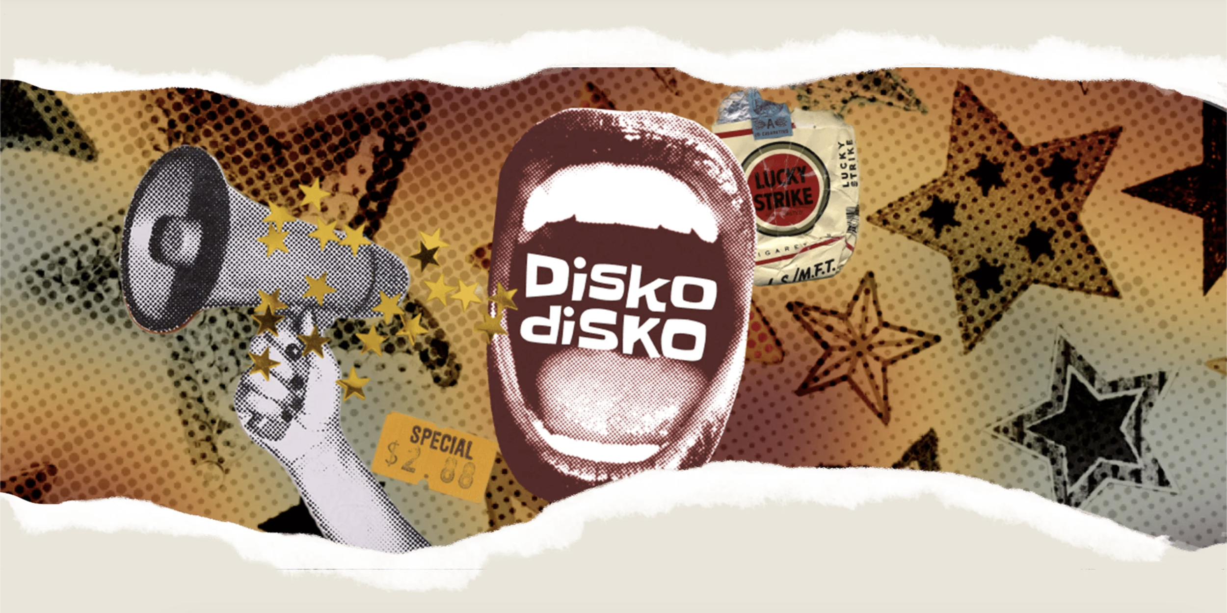
The brand needed to feel authentic, raw, and passionately hand-crafted—a direct reflection of the music scene it covered. Instead of a slick, corporate look, we embraced a collage aesthetic inspired by DIY zines, gig posters, and album art.
Art Direction & Collage Aesthetic: We developed a visual system that used intentional layering, ripped paper textures, and overlapping elements. This approach felt immediate and authentic, mirroring the energy of a live show. It stood in deliberate contrast to the clean, minimalist designs of competitors, positioning Disko as raw, authentic, and deeply embedded in the culture.
Typography & Color: The typography mixed bold, distressed display fonts (evocative of punk and indie flyers) with readable body text for legibility. A vibrant, sometimes clashing, color palette was used to create energy and highlight key elements, further reinforcing the DIY ethos.
Application: This collage style was applied consistently across key touchpoints: website hero sections, featured article graphics, and most importantly, as a signature style for social media promotion. It created an instantly recognizable visual language in a crowded feed.